Distinctive by design. Useful by default.

A strong website should feel unmistakably yours without making people work harder to use it. The visual identity, page hierarchy and everyday interactions need to support the same message.

Mind Methods translates your brand into a responsive website design with a clear purpose. We consider typography, colour, imagery, spacing and motion alongside the content people need and the actions you want them to take. The aim is character and clarity, not a collection of fashionable effects.

We develop representative pages and reusable components so the design holds together beyond the homepage. Mobile layouts, longer content, forms and interaction states are considered early, with direction your development team can implement consistently.

Design can be delivered as a defined engagement or as part of our website design and development service. We agree on the brand inputs, content responsibilities, review stages and handover requirements before detailed production begins.

“Good marketing is clarity plus courage. Clarity about the customer and what truly moves them. Courage to focus on the few activities that will make the biggest difference. Our job is to bring both, so your team knows exactly what to do next, and why.”

Simon Tokic, Co-Founder, Mind Methods
78%

of surveyed shoppers use retailer websites

Your own website still has a role to play.

Australia Post's 2026 report identifies retailer website use among 78% of surveyed shoppers.

Planning implication: make the brand and offer clear on your own site, with information that supports comparison and choice.

2026 eCommerce Report; 2025 data
Australian eCommerce Report Survey, 2025. Shopper use, not share of spending, visit frequency or market share.

83.9%

of tested home pages had low-contrast text

Visual character should not come at the cost of reading.

Low-contrast text was detected on 83.9% of home pages in WebAIM's February 2026 study.

Planning implication: check colour combinations, type and interface states as the design develops.

WebAIM Million; February 2026
One million popular home pages worldwide, tested automatically. Not an assessment of Mind Methods designs or all accessibility needs.

19%

reported abandoning an order over payment trust

Reassurance belongs in the interface.

Baymard reports that 19% of US online shoppers abandoned an order because they did not trust the site with card information.

Planning implication: present genuine business details, clear policies and understandable payment steps. Visual polish is not a substitute for security.

2026 survey summary; fieldwork dates not specified
US self-reported checkout behaviour in the 2026 summary. The study does not establish visual design as the cause of distrust.

15.2%

of tested pages contained ambiguous link text

A link should help people choose the next step.

WebAIM found ambiguous link text, such as unclear next-step labels, on 15.2% of sampled home pages.

Planning implication: write purposeful link and button labels alongside the layouts, then review them in context.

WebAIM Million; February 2026
Global home-page study, February 2026. A content/interface observation, not a measured conversion effect.

Start with the problem, not a package.

01
The brand has been refreshed, but the website still feels like a different business.
Translate the identity into a complete digital experience.

Extend the approved visual language into page layouts, imagery, typography and interactions. Show how it works across representative pages rather than stopping at a new logo and colour palette.

02
The homepage looks strong. The rest of the site loses its character.
Create a system that carries the idea through.

Define reusable components and page types with clear rules for content, spacing and imagery. Test them with realistic material so consistency does not depend on redesigning each page by hand.

03
The design gets attention, but people miss the important information.
Give the page a clearer visual order.

Review competing headings, imagery, calls to action and supporting detail. Establish what people should notice first, then make the next decision easier without flattening the brand into a generic template.

04
The approved design changes as soon as development begins.
Make design intent easier to implement and check.

Provide agreed component rules, responsive examples and interaction states, then review representative built pages against them. Clarify necessary compromises together instead of allowing silent substitutions to become the finished site.

Website design questions, answered.

Yes. We start with the approved identity and assess what needs to be defined for digital use. Typography, colour, imagery and layout decisions should strengthen that identity. Where the brand itself needs changing, that work is discussed separately rather than quietly folded into website design.

No. Website design applies the brand to a digital experience. Naming, positioning, a new logo or a broader identity system are different scopes, although they can be coordinated with the website project when needed.

Responsive behaviour is part of the design brief, including navigation, content priority and key interactions. We review representative layouts at different widths rather than treating mobile as a smaller copy of the desktop page. The built result still needs device and browser testing.

Yes, with the platform constraints and handover needs agreed upfront. The scope can include representative pages, component rules, interaction notes and implementation review. We clarify who owns any follow-up decisions so the developer is not left to guess.

We agree on review stages, decision-makers and the work included in each stage. Early direction is reviewed before extending the design across page types. Consolidated feedback keeps changes tied to the brief and makes the implications of a new direction visible.

We consider readable colour and type, clear controls, focus and error states, and different ways of navigating. We agree on the applicable accessibility requirements and evaluation scope. Design files alone cannot establish conformance: content, development and testing must support the same requirements.

Related campaign thinking

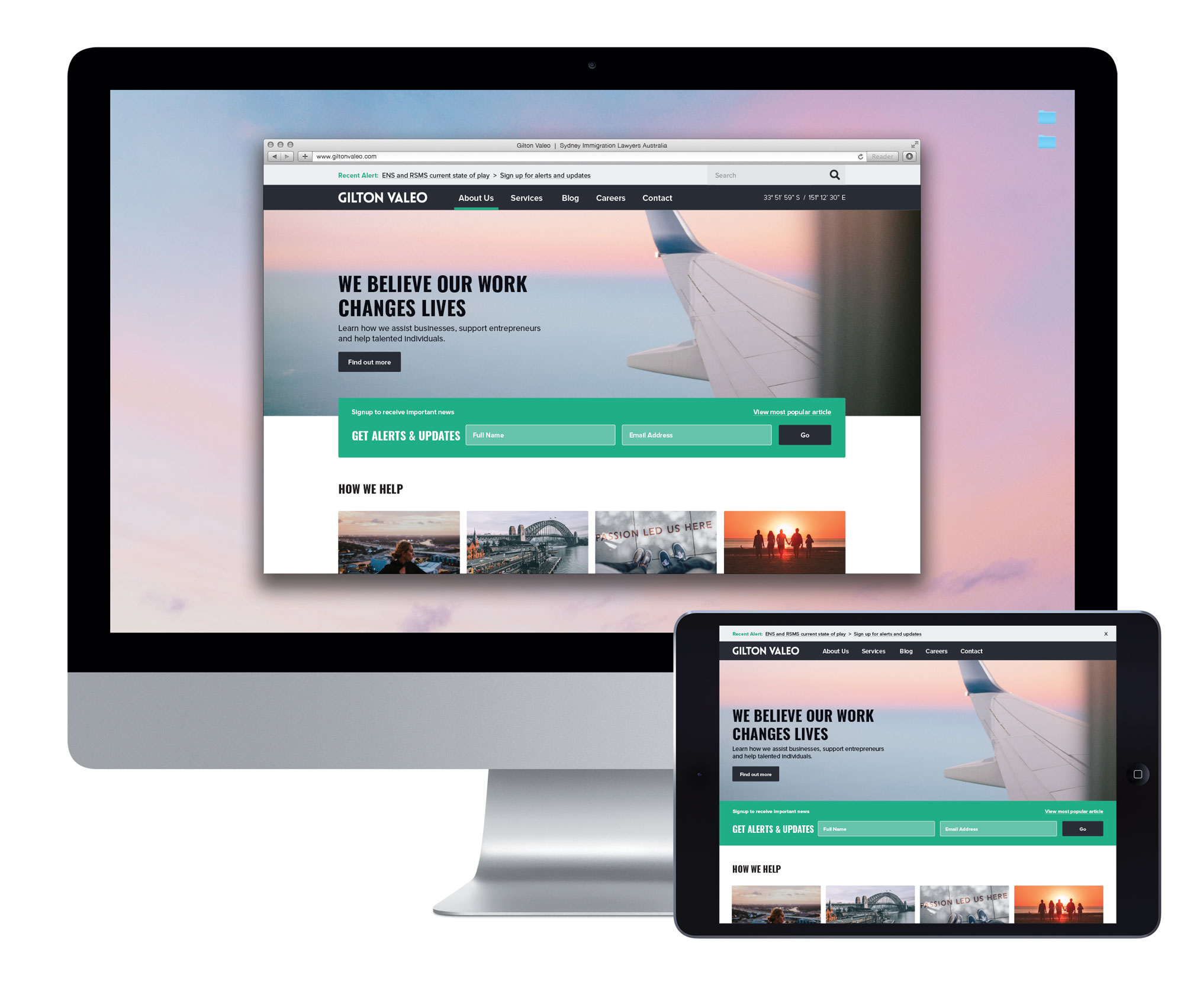
  • Gilton Valeo website displayed on a desktop monitor and tablet, with travel-inspired imagery and an email sign-up form.
    Law firm website design
  • Sukari branded Revitalise pump bottle and matching product packaging
    Sukari Interior Design brand identity development
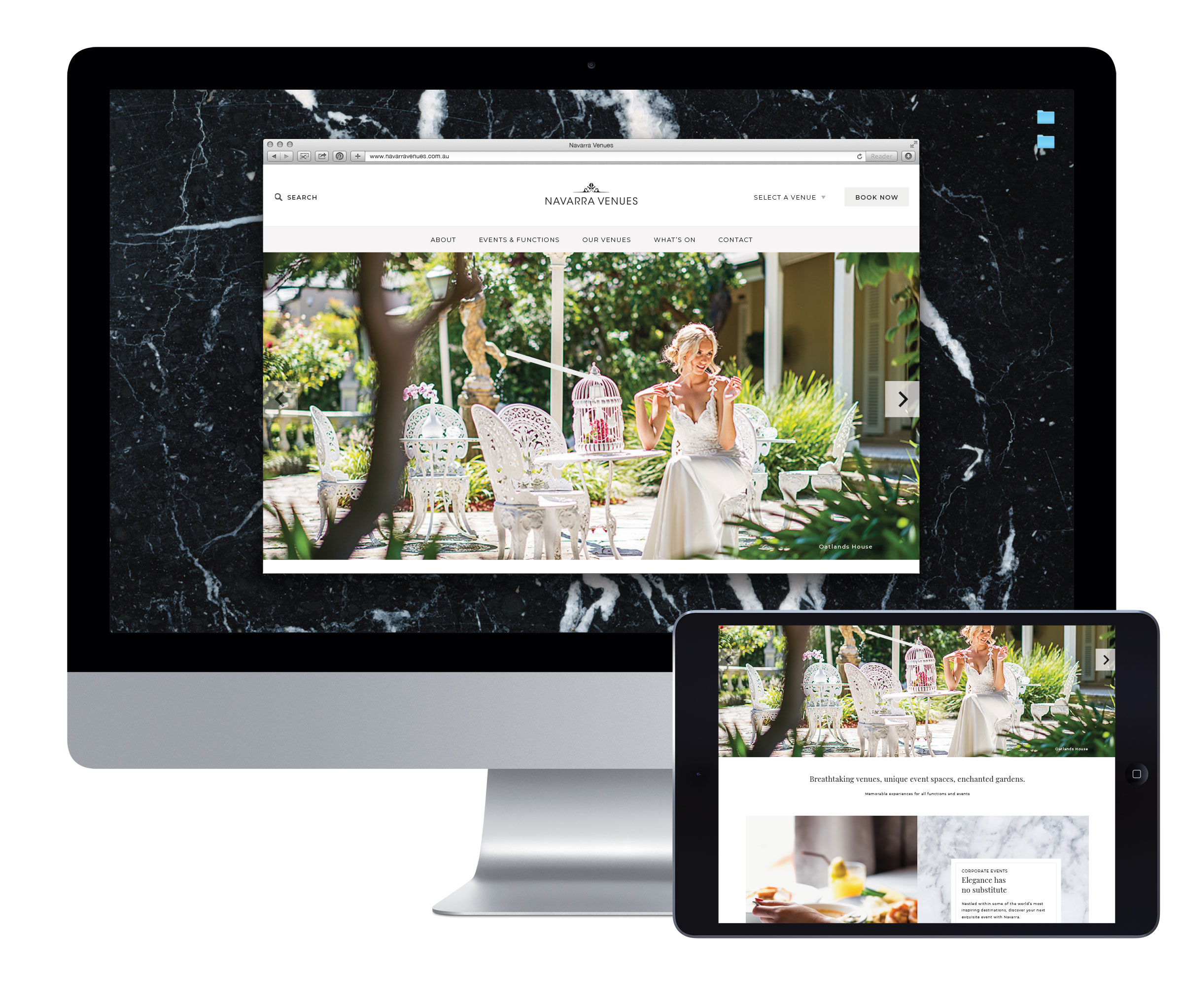
  • Navarra Venues website displayed on a desktop monitor and tablet, featuring its event spaces and hospitality photography.
    Hospitality industry website design