Gilton Valeo
Immigration law website design with a first-class travel perspective.
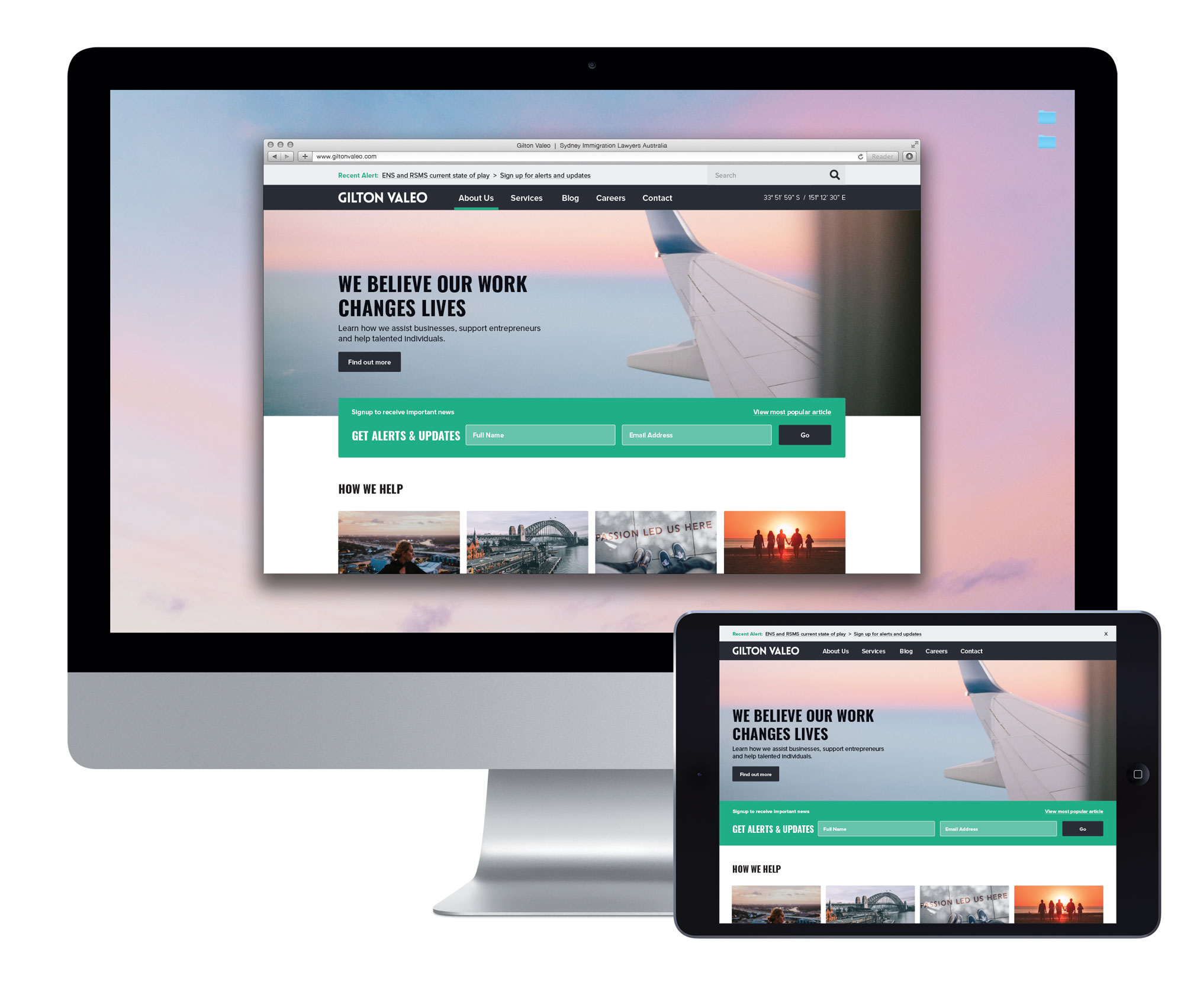
Gilton Valeo needed a website that could do more than introduce the firm. Following its brand strategy and identity work with Mind Methods, the immigration law business needed a digital home that reflected its character and supported ongoing communication.
The website project translated that brand direction into a travel-inspired experience, combining responsive layouts, considered typography and photography with a clearer role for articles and email sign-up. This case focuses on the website, distinct from the firm’s broader brand and social media projects.
INDUSTRIES:
Legal Services
SERVICES:
Content Strategy; Creative Lab; Marketing Studio; User Experience (UX) Strategy; Website Design; Website Development
Previous website.
Needs & Brief
Move beyond a brochure-style website and create a more useful platform for the firm’s marketing communications. The site needed to present the refreshed brand, work across devices and make ongoing content easier to publish and engage with.
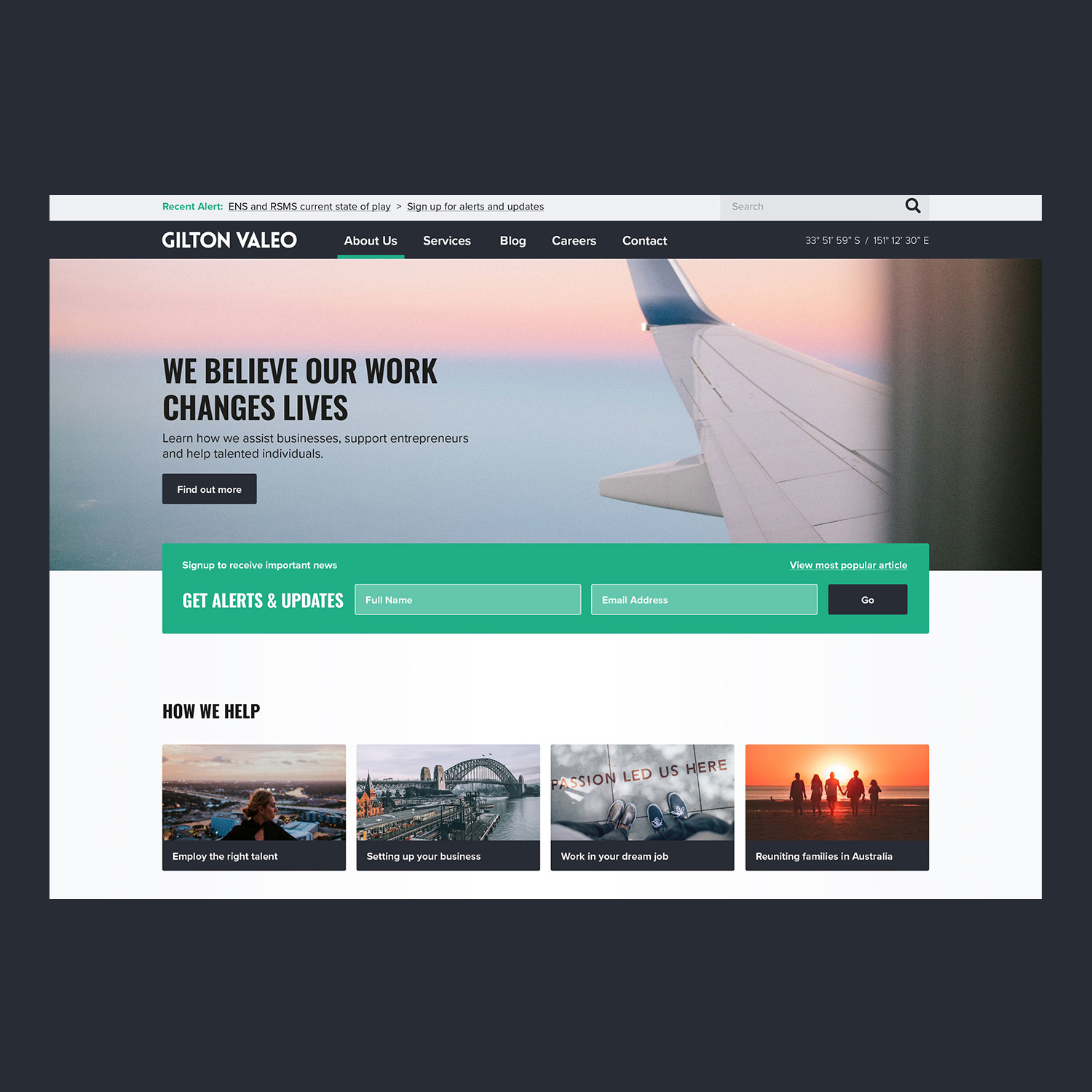
Email sign-up was identified as the main homepage call to action, giving the design a specific customer journey to support.
Challenges & Context
The creative challenge was to express the firm’s modern, progressive character without falling back on familiar immigration-law imagery. The website needed to remain clear and useful while presenting a distinctive point of view.
There was also a practical content challenge: the previous site offered limited scope for the kind of well-presented articles the firm wanted to share. Visual character and publishing needs therefore had to be considered together.
Strategic & Creative Approach
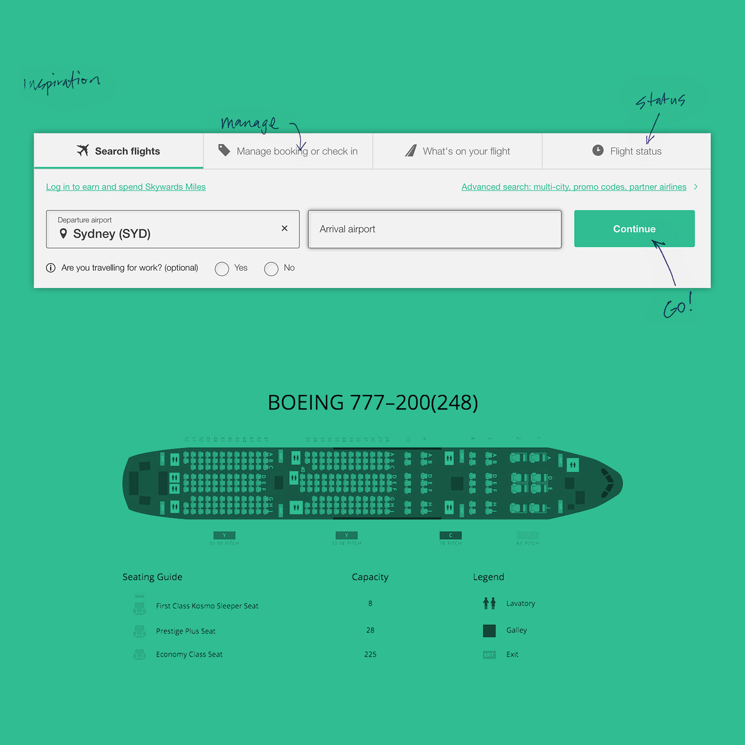
We used the documented brand direction as the starting point, carrying its lifestyle and travel themes into the website rather than developing a disconnected online identity. Airline aesthetics, flight information and booking experiences informed the visual and interaction concepts.
One specific decision was to reinterpret the familiar travel search bar as an email sign-up form. This gave a recognisable design device a practical role in the homepage’s primary call to action.
The work combined website and layout design, user-experience planning, content structuring and CSS styling. Photography direction and image treatment reinforced the brand character, while selected typefaces addressed legibility.
The resulting site provided a digital setting for the identity and a stronger basis for article-led communication.
The travel idea needed to do more than give the site a distinctive look. It had to help people understand the brand and know what to do next. Turning a familiar search-bar pattern into email sign-up connected that creative direction to a practical purpose.
Nathan Lee
Mind Methods