Sukari Interior Design
A fresh identity to reconnect an interior design studio with its audience.
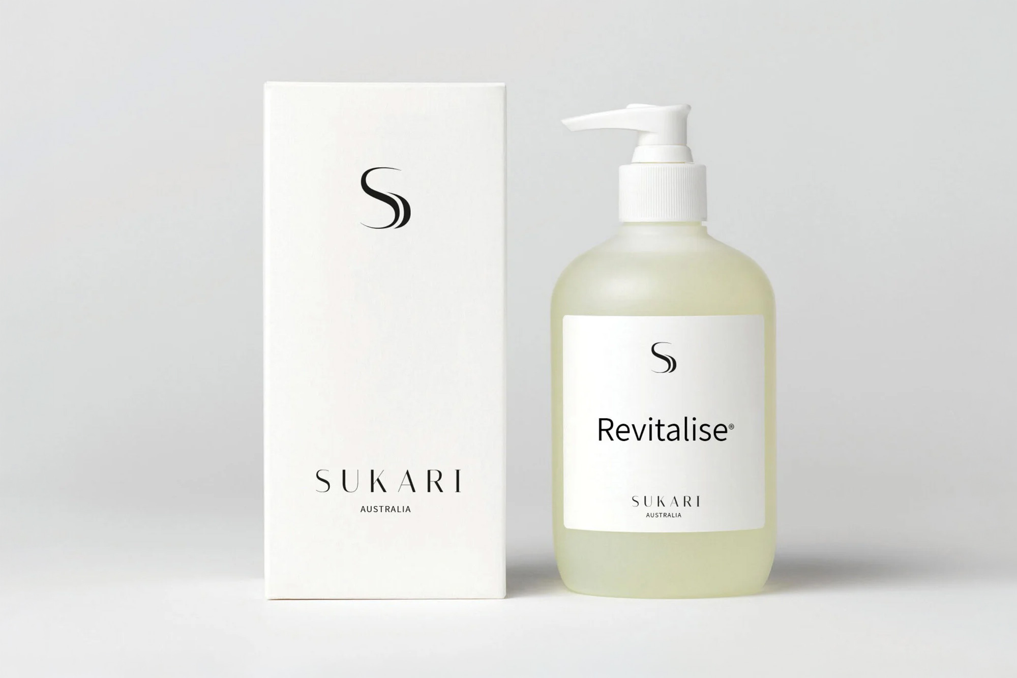
Sukari Interior Design works across residential and commercial projects, from floor plans and colour advice to soft furnishings. The Sydney studio wanted to refresh its brand as it returned to the market.
Mind Methods developed a new logo and carried the identity into a simpler website and social media campaign. The work gave the studio a consistent, contemporary presentation without losing sight of its existing character.
Needs & Brief
Update the logo and branding before renewing the studio’s website and social presence. The identity needed to feel fresh and be flexible enough to work across the places potential clients would encounter the business.
Challenges & Context
A refresh needed to build on an existing identity while moving the presentation forward. The design process had to establish which elements were worth retaining and which made the brand feel less current.
The logo also needed to work in practical digital formats, not only as a standalone design.
Strategic & Creative Approach
We explored a lighter, taller interpretation of the existing mark and developed new lettering to suit it. Client feedback then led to a simpler direction, with consistent lettering and no separate symbol.
The resulting wordmark was compact and adaptable. We used it as the foundation for updated messaging and the studio’s digital presentation.
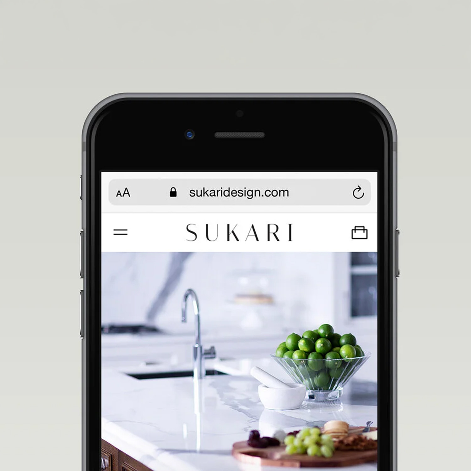
A social media campaign directed people to a landing page, while the website was simplified and modernised to reflect the refreshed identity. These applications connected the design work with the studio’s return to active promotion.
A refresh does not always need more detail. For Sukari, simplifying the identity gave the studio a stronger foundation, with a logo and digital presence that could work together clearly and consistently.
Nathan Lee
Mind Methods