Make the next step feel obvious.

Customers should not have to understand your organisation chart to find the right service. They need a clear route from their question to the information, reassurance or action that helps them move forward.

Mind Methods develops user experience strategy around those real tasks. We bring together the business objective, available analytics, customer and team insight, and targeted research to understand where the current journey helps or gets in the way.

That evidence informs the page hierarchy, navigation, content priorities and key flows. Wireframes and prototypes make the important decisions easier to discuss and test before detailed design or development adds cost. Research depth, participant recruitment and testing are agreed to suit the project, with assumptions clearly separated from observed behaviour.

Whether you are improving an existing site or planning a new one, the output is direction your team can use: what to simplify, what to test and what to build first. UX can stand alone or form part of our website design and development work.

“Good marketing is clarity plus courage. Clarity about the customer and what truly moves them. Courage to focus on the few activities that will make the biggest difference. Our job is to bring both, so your team knows exactly what to do next, and why.”

Simon Tokic, Co-Founder, Mind Methods
17%

reported abandoning a complicated checkout

Every unnecessary step needs a reason.

Baymard reports that 17% of US online shoppers abandoned an order because checkout was too long or complicated.

Planning implication: review the information genuinely needed to complete the task and test where steps can be simplified.

2026 survey summary; fieldwork dates not specified
US self-reported shopping behaviour in the 2026 summary. Not a conversion forecast or an Australian service-enquiry benchmark.

69%

want a choice of delivery options

Understand the decision, not just the screen.

Australia Post reports that 69% of shoppers want a range of delivery options at checkout.

Planning implication: research the choices and reassurance customers need before defining the flow and its content.

2026 eCommerce Report; 2025 data
Australian shopping preferences; November 2025 Omnibus Survey, reported in 2026. Preference is not evidence of conversion uplift.

33.1%

of tested form inputs lacked proper labels

A form should explain itself to every user.

WebAIM found that 33.1% of form inputs across its sampled home pages were not properly labelled.

Planning implication: specify labels, instructions and error recovery in the journey, then check their implementation.

WebAIM Million; February 2026
Automated evaluation of one million popular home pages, February 2026. Global sample; not a complete accessibility assessment.

21.4%

of Australians had disability in 2022

Include different access needs in the brief.

More than one in five Australians had disability in the ABS 2022 survey.

Planning implication: include relevant access needs when choosing research participants, tasks and acceptance criteria.

2022 survey; published July 2024
Australian population estimate published in 2024. Disability does not imply one uniform access need or reliance on assistive technology.

Start with the problem, not a package.

01
The navigation makes sense internally, but customers cannot find the right service.
Organise around the task, not the team chart.

Review common enquiries, search behaviour and the language people use. Test a clearer grouping and naming approach so the sitemap reflects how customers look for help.

02
Everyone has a strong opinion about the homepage.
Give the discussion a shared basis.

Agree on priority audiences, tasks and the decisions the page needs to support. Use evidence and a simple prototype to compare options instead of treating the loudest preference as the brief.

03
People start an enquiry or checkout, then disappear.
Find the friction before adding another prompt.

Examine the sequence, field requirements, reassurance and error handling. Combine available behavioural data with targeted observation to identify a practical test, rather than assuming every exit has the same cause.

04
The desktop journey is clear, but mobile feels like a compromise.
Prioritise the task for the smaller screen.

Review what people need first, how navigation behaves and whether key actions remain usable. Document the mobile journey and content priorities before detailed layouts are produced.

UX strategy questions, answered.

UX strategy defines who the experience is for, what they need to do and how the journey should work. Website design translates those decisions into the visual interface and brand experience. The two disciplines work together, but attractive screens alone do not settle the underlying journey.

Yes. A focused review can identify confusing structure, content gaps or friction in a key journey. The output can be a prioritised improvement brief for your existing team, with changes grouped by impact, effort and the evidence available.

Direct input is useful when the project needs it, but we agree on an appropriate research approach first. Analytics, support enquiries and internal interviews can establish an initial picture. Where participants are required, recruitment, consent and time commitments are scoped explicitly.

Depending on the brief, these may include audience and task priorities, a content or journey audit, an information architecture, wireframes, prototypes and a prioritised action plan. We select the outputs that help your team make decisions rather than producing every artefact by default.

Yes. Finding the right service, understanding suitability, locating evidence and making an enquiry are user tasks too. The research and success measures should reflect that context; retail checkout benchmarks should not be treated as B2B conversion targets.

We agree on measures suited to the task, such as completion, observed difficulty, relevant enquiries or purchase progression. Baselines and testing methods depend on the available traffic and data. Recommendations remain hypotheses to evaluate, not guaranteed commercial uplifts.

Related campaign thinking

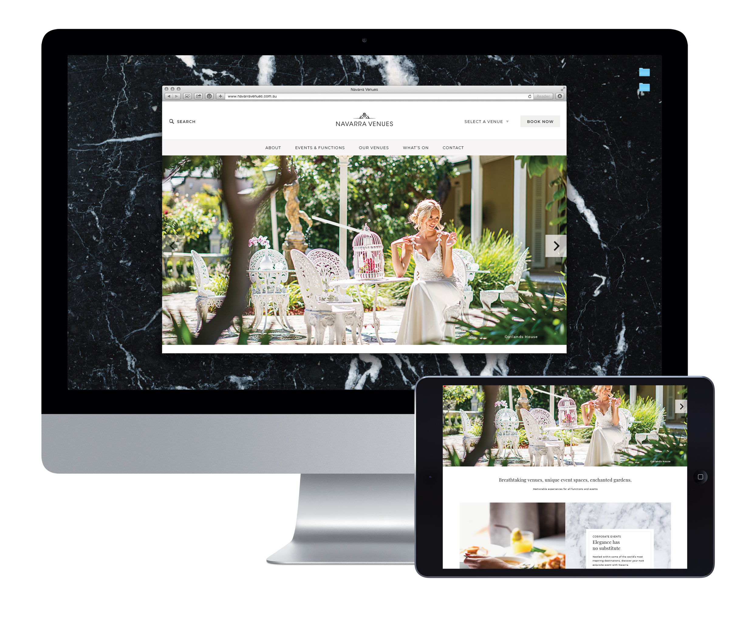
  • Navarra Venues website displayed on a desktop monitor and tablet, featuring its event spaces and hospitality photography.
    Hospitality industry website design
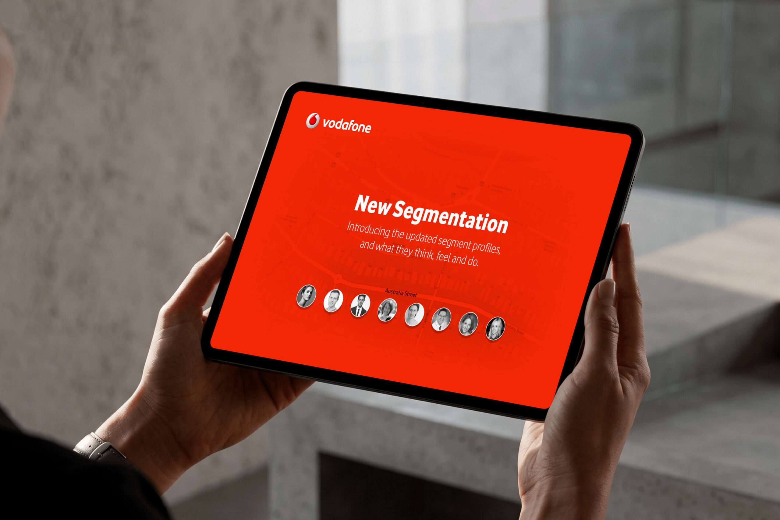
  • Vodafone customer segmentation presentation displayed on a tablet
    Australia Street digital solution for Vodafone
  • Original Mind Methods image accompanying the article about five factors supporting SEO results
    Five critical factors supporting online marketing and SEO results