St Marys Town Centre brand artwork showing a woman holding a coffee and the Inspired by Growth tagline

St Marys Town Centre needed a refreshed identity that could represent a place, its businesses and the community around them. The brief called for a more contemporary brand while retaining a connection to the area’s character and history.

Mind Methods developed an identity with flexible logo variations, then translated it into stationery and a practical brand handover. The result gave the organisation a recognisable set of marks and guidance for applying them across future digital and print communications.
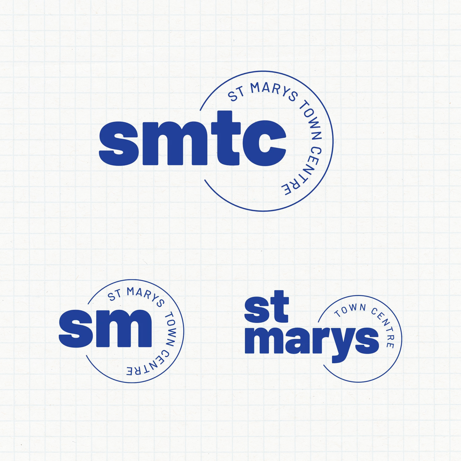
Three blue St Marys Town Centre logo variations on a grid
St Marys Town Centre brand identity

Identity approach.

Blue St Marys Town Centre branded print collateral
Needs & Brief

Refresh the brand to reflect the town centre’s strategic direction and the aspirations expressed by its board. The identity needed broad appeal and enough flexibility to work across different applications.

The project also needed to equip the client with usable artwork and guidance, so the new identity could extend beyond the initial design presentation.

Challenges & Context

A town-centre identity has to speak to several perspectives: local businesses, stakeholders and the wider community. The challenge was to find a common direction without reducing the place to a generic mark.

The brief also asked the brand to balance heritage with modernity. Local character mattered, alongside the future aspirations described in the client’s briefing material.

Strategic & Creative Approach

We began with the client’s briefing guide, using the board’s aspirations and understanding of the community to shape the creative direction. This gave the design process a specific local context rather than starting with visual trends alone.

Concept development and refinement explored how that direction could be expressed through the brand marks. The selected identity accommodated several logo lockups, allowing the same underlying character to work in different spaces and formats.

We applied the identity to letterheads and other stationery, then prepared a brand guide and logo pack. Together, these provided both the artwork and the reference material needed to carry the refreshed brand into subsequent communications.

1

Shared identity

A recognisable town-centre brand

The refreshed identity brought the brief's local character and future direction into a common visual expression for the organisation's communications.

FLEX

Adaptable marks

One identity, several useful variations

Multiple logo lockups allowed the identity to work across different spaces and applications without treating each new format as a separate brand.

KIT

Practical handover

Artwork and guidance for continued use

A logo pack and brand guide gave the client usable assets and a reference for maintaining consistency across digital and print work.

USE

Everyday application

The refresh put into practice

Letterheads and other stationery demonstrated how the identity could carry through to the materials used in the organisation's day-to-day communication.

A place brand needs enough character to feel connected to its community and enough flexibility to be useful every day. The goal for St Marys Town Centre was not just a new mark, but an identity the team could carry consistently into many different applications.

Nathan Lee
Mind Methods

Frequently asked questions

The brief called for a more contemporary brand that reflected the town centre's direction while remaining connected to its local character. It also needed flexibility across applications and broad appeal to the businesses, stakeholders and community represented in the brief.

The work included the refreshed identity, several logo lockups, stationery applications, a logo pack and a brand guide. These combined practical artwork with guidance, giving the organisation a foundation for applying the brand to later digital and print communications.

We clarify the brief, the perspectives that need to inform it and the decision-making process. Agreed review points and consolidated feedback help keep creative development connected to the organisation's objectives, rather than turning each review into a separate design brief.

Yes. A refresh starts with understanding which aspects of the existing brand have value and which no longer support its direction. We can explore continuity as well as change, with the extent of the redesign agreed around the brief rather than assumed at the outset.

Yes. Applications such as stationery, collateral and digital assets can be included in the scope. We prioritise the formats your team needs, define who will produce them and establish guidance so that the identity remains consistent beyond the initial launch.

We agree what the identity needs to communicate and where it needs to work. Review can cover alignment with the brief, usability of the artwork and the quality of the handover. Broader changes in awareness, visitation or sales need their own measurement rather than being assumed from a redesign.