Rock Hardware
A specialist retail brand shaped around its climbing community.
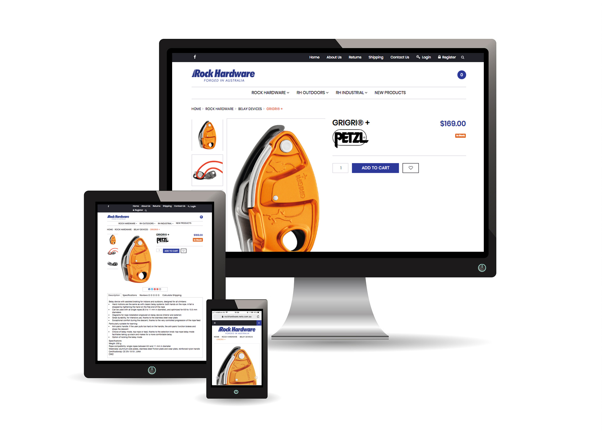
Rock Hardware wanted its brand and online store to better reflect its experience within the climbing community. The Victorian retailer needed a more consistent presentation across the shopfront, business materials and website.
Mind Methods refreshed the identity, developed store signage and reorganised the online product range. The work connected the brand’s outdoor character with a more useful shopping experience for enthusiasts and professional climbers.

Needs & Brief
Strengthen the retailer’s brand presence and make its online inventory easier to navigate. The identity needed to recognise the business’s history and specialist knowledge while working consistently in store and online.
Challenges & Context
The range served customers with different levels of climbing experience. Product information needed to be clear enough to help people choose, while the brand needed to feel credible within the specialist community.
The physical and online presentation also needed to look like the same business.
Strategic & Creative Approach
We developed a visual direction drawing on earthy outdoor tones and mountain imagery, with messaging recognising the business’s long-standing service to the climbing community. A brand report documented the direction.
The refreshed identity was applied to outdoor signage and business cards, then carried into the online store. We organised the inventory to make browsing easier and strengthened the presentation of the retailer’s established brand partners.
Product pages were developed to provide useful information for both enthusiasts and professional climbers. This connected the brand refresh with practical improvements to how customers explored the range.
The business already had genuine experience in its community. We wanted the identity to reflect that, and the online store to make its specialist range easier for customers to understand and explore.
Nathan Lee
Mind Methods