Lower Bar CBD / Navarra Venues
A new venue identity built around the character of a historic space.
Case Study
Brand DivisionBrand Identity & Logo DesignCampaign Creative & Art DirectionCommunications Strategy & Integrated MarketingCompetitor AnalysisCreative LabEmail Marketing & AutomationGo-to-Market & Product Launch StrategyMarketing AdvisoryMarketing StudioPhotography & RetouchingRebranding & Brand RefreshWebsite Design
Case Study
Brand DivisionBrand Identity & Logo DesignCampaign Creative & Art DirectionCommunications Strategy & Integrated MarketingCompetitor AnalysisCreative LabEmail Marketing & AutomationGo-to-Market & Product Launch StrategyMarketing AdvisoryMarketing StudioPhotography & RetouchingRebranding & Brand RefreshWebsite Design
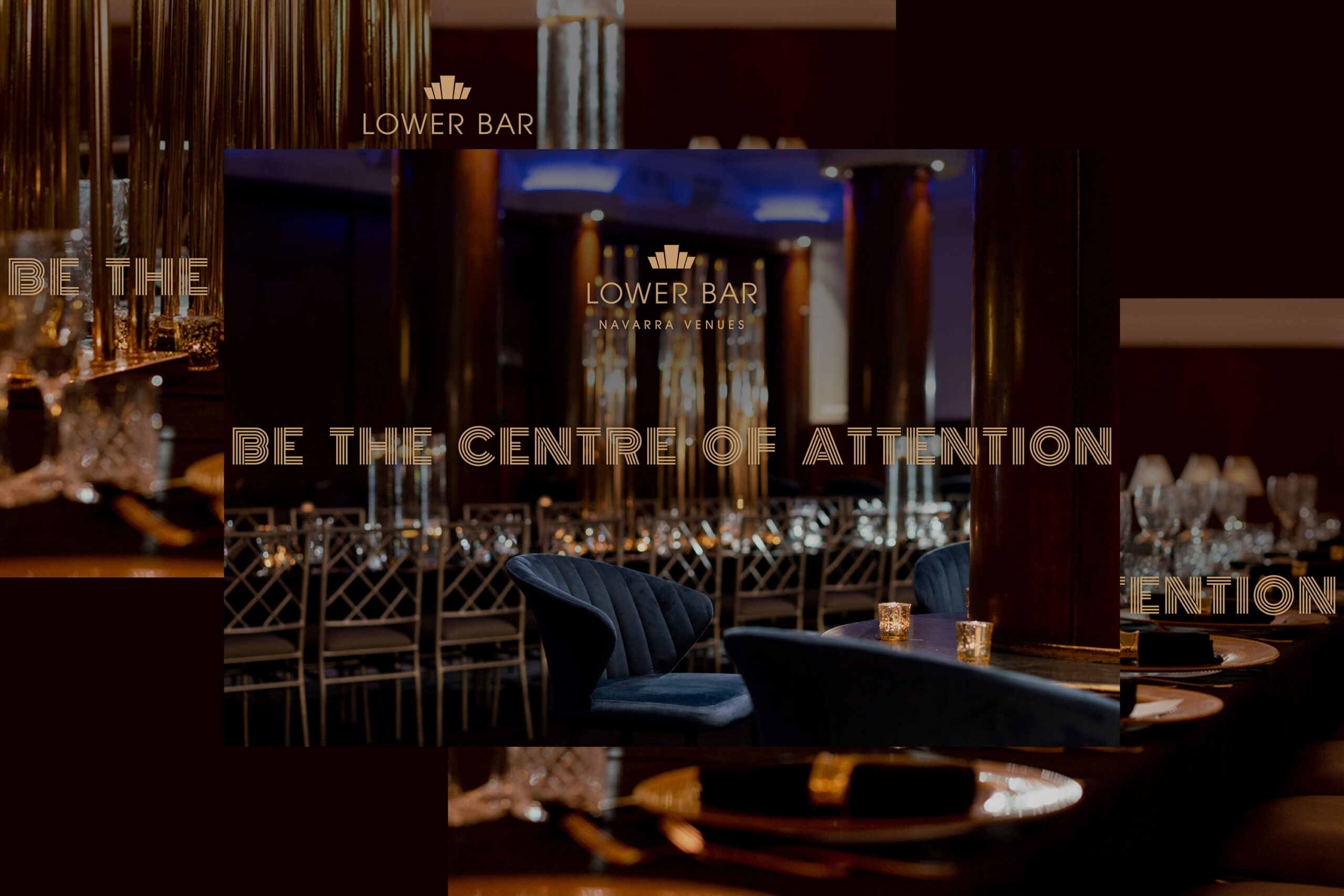
Navarra Venues was launching its first Sydney CBD offering in a heritage art deco building. Lower Bar CBD needed to express its own history and atmosphere while retaining the quality associated with the wider group.
Mind Methods developed the brand and launch direction, including a refreshed logo, photography guidance and coordinated marketing materials. The work made the venue’s character central to its introduction rather than treating it as another location in the portfolio.
INDUSTRIES:
Hospitality & Venues
SERVICES:
Brand Division; Brand Identity & Logo Design; Campaign Creative & Art Direction; Communications Strategy & Integrated Marketing; Competitor Analysis; Creative Lab; Email Marketing & Automation; Go-to-Market & Product Launch Strategy; Marketing Advisory; Marketing Studio; Photography & Retouching; Rebranding & Brand Refresh; Website Design
Needs & Brief
Create a distinctive identity and communications approach for the new venue. The launch needed to explain the space’s features, heritage and range of event uses while remaining recognisably part of Navarra Venues.
Challenges & Context
The heritage building had a genuine history, including its earlier role as a horse-racing institution. That gave the venue a stronger story than a decorative theme alone.
The brand needed to balance this individual character with the existing group’s signage, sophistication and presentation.
Strategic & Creative Approach
We explored two visual directions drawing on contrasting vintage New York influences. Moodboards helped connect the historical references with the experience the venue wanted to offer.
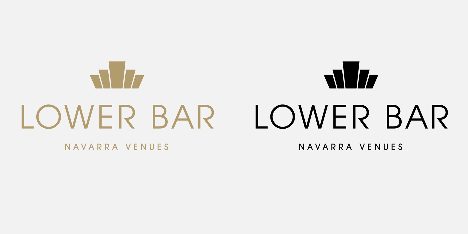
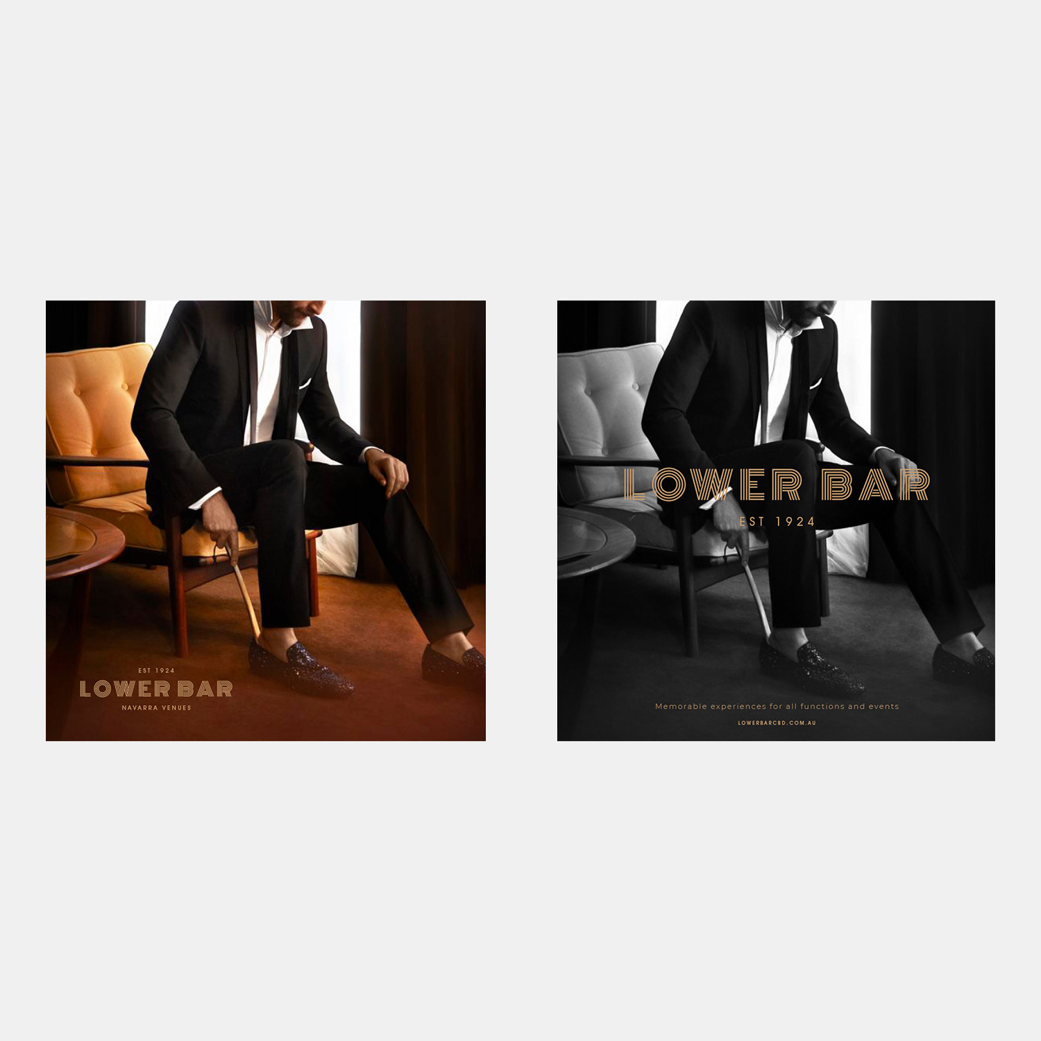
The logo was refined to work with the existing Navarra identity and the building’s character. We developed social design guidance and styling direction for photography so the same idea could carry into the images and communications.
Launch support connected brand and communications planning with email, media material, signage, website and landing-page design. The resulting asset set gave the venue a distinct introduction within the wider portfolio.
The venue had a real story to work with. We used its history and character to create a distinct identity, while making sure it still felt at home within the Navarra group.
Nathan Lee
Mind Methods