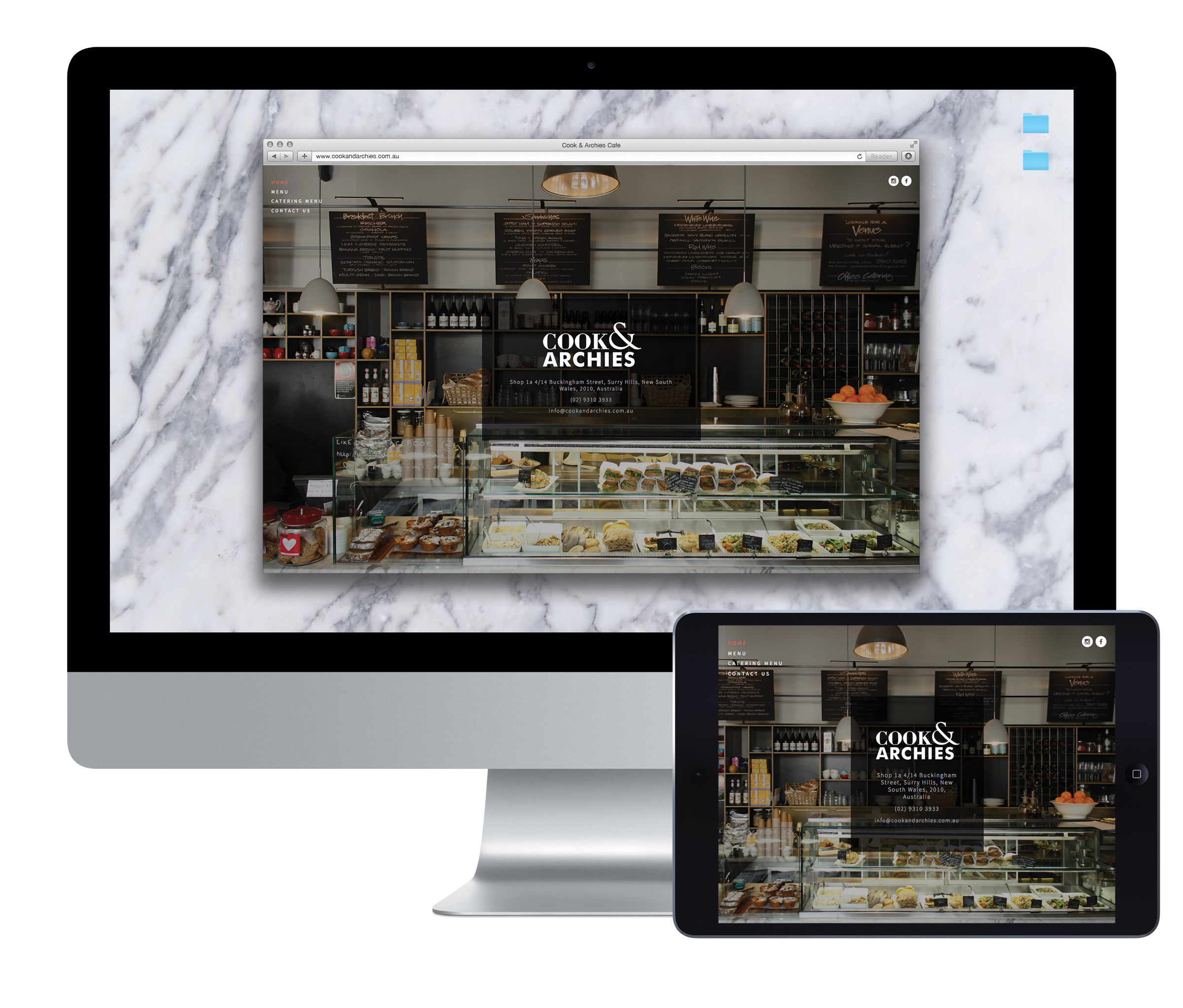
Cook and Archies website displayed on a desktop monitor and tablet, featuring the cafe interior.

Cook & Archies opened in Surry Hills, where cafes compete for attention in a busy food and hospitality scene. The owners wanted marketing that reflected the venue and helped it establish a professional presence.

Mind Methods developed the identity, website and a range of printed materials. From menus and cups to photography and the online experience, the work brought the cafe’s presentation together.
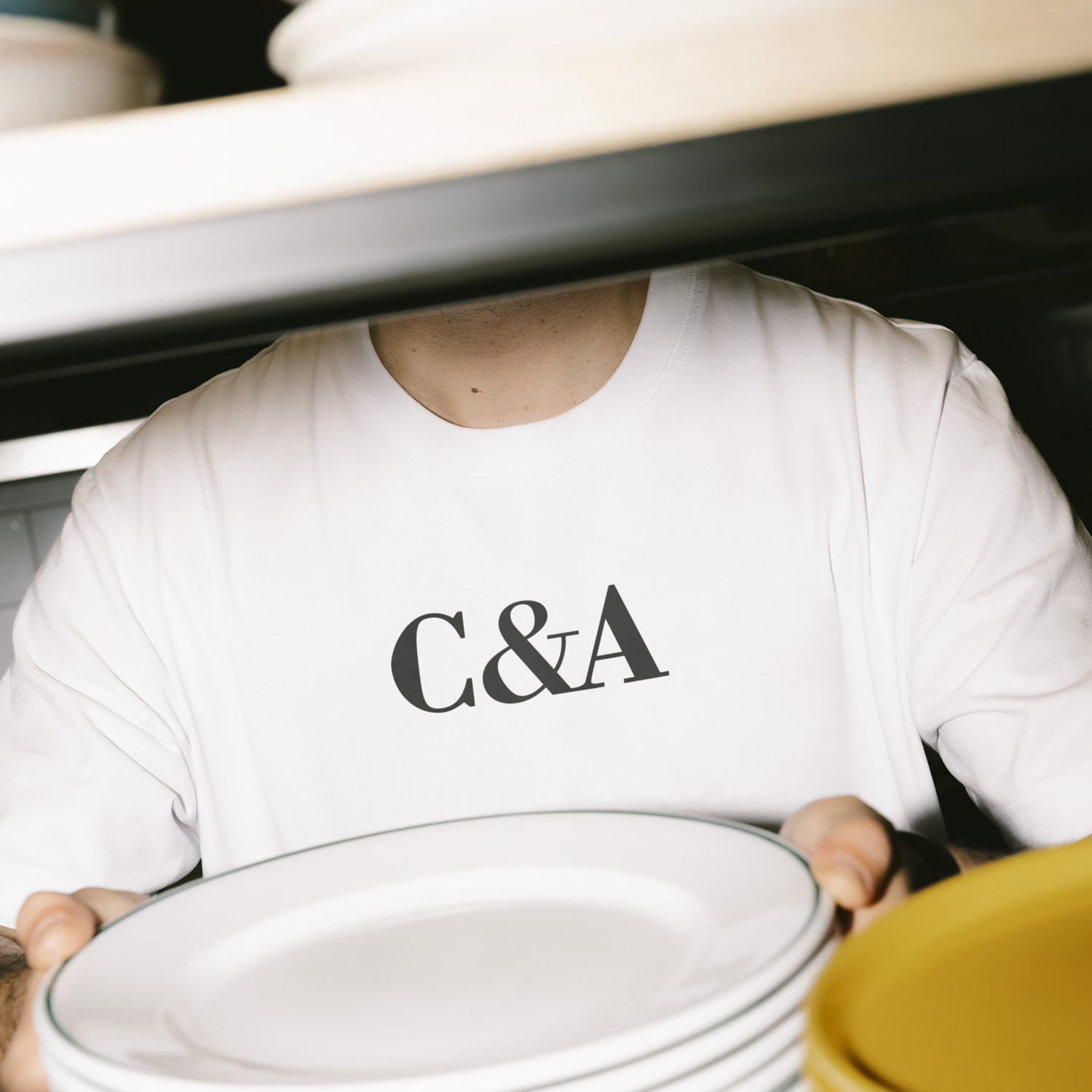
Cafe staff member wearing a Cook & Archies branded shirt and holding plates
Cook & Archies branded apparel
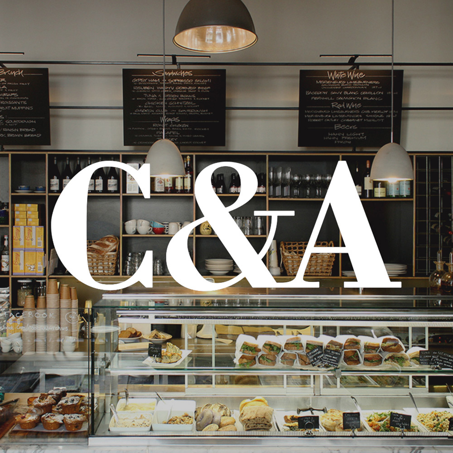
Cook and Archies monogram over a photograph of the cafe counter and menus
Cook and Archies dark grey wordmark on a light grey background
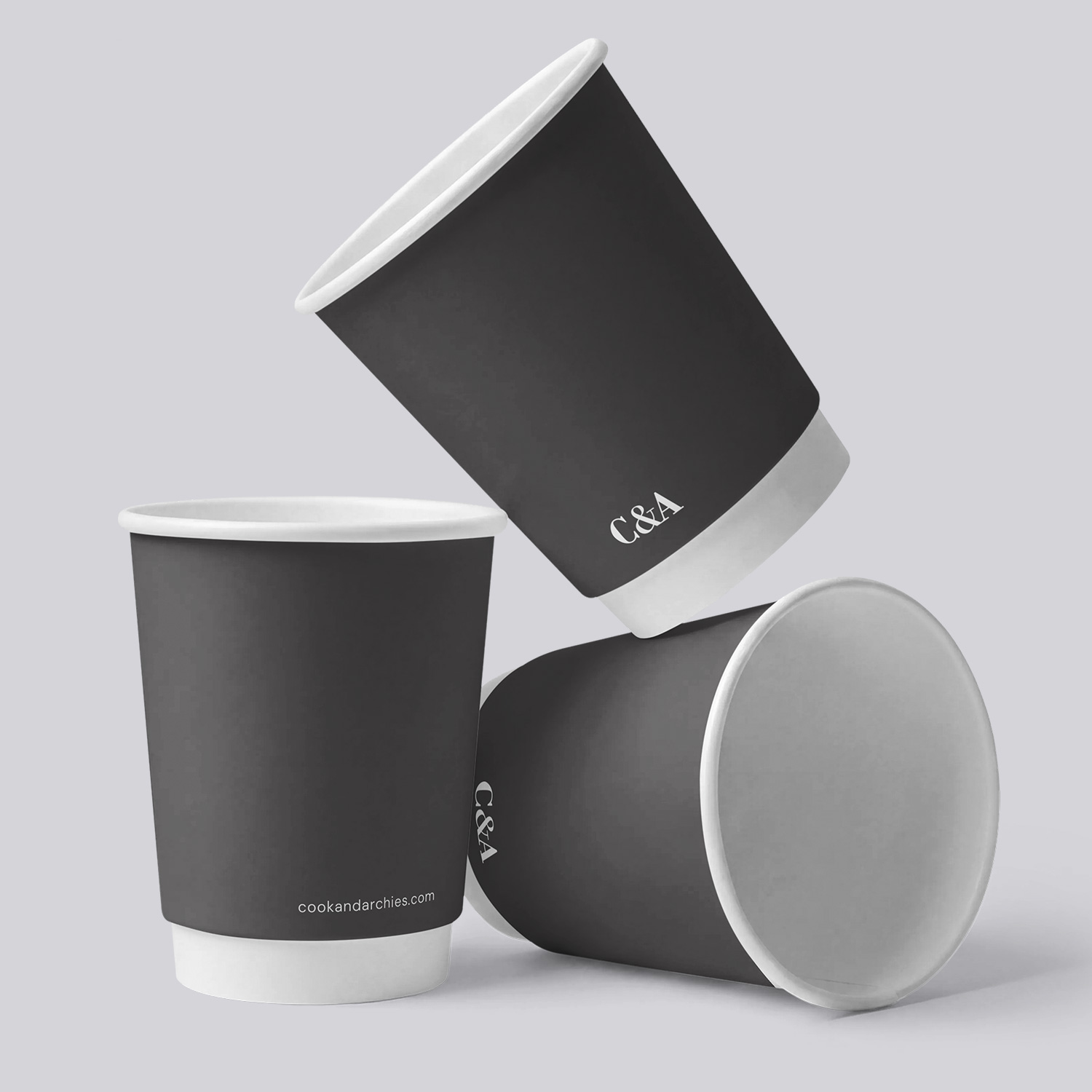
Three dark takeaway coffee cups carrying the Cook and Archies monogram
Needs & Brief

Create a recognisable identity and useful marketing foundations for the cafe. The brief covered both the physical venue and its online presence, with materials that could support everyday service as well as introduce the business to new customers.

Challenges & Context

In a neighbourhood with many appealing dining choices, the cafe needed to express its own character. The design also had to work on practical items used every day, not only on a screen.

Consistency mattered across menus, takeaway items, photography and the website, where customers could form their first impression before visiting.

Strategic & Creative Approach

We developed the logo and supporting identity, including a compact version that could work as an insignia. This made the brand usable across different sizes and formats.

The identity was applied to menus, stationery, promotional material and takeaway cups, including a 12oz cup design. Photography and website design connected the online presentation with the venue itself.

Print management and social media planning supported the wider work. The result was a coordinated set of in-store and online materials rather than isolated design pieces.

1

Cafe identity

A recognisable visual character

A logo and supporting brand applications gave the cafe a consistent face across its materials.

WEB

Online presence

A digital introduction to the venue

Website design and photography presented the cafe beyond its physical location.

MENU

Everyday design

The identity put to work

Menus, takeaway cups and stationery carried the brand into the customer experience.

KIT

Marketing foundations

Useful materials for the team

Coordinated print and digital assets gave the owners a practical starting point for continued promotion.

For a cafe, the brand lives in small everyday moments as well as the website. We wanted the menus, cups, photography and online presence to feel like they belonged to the same place.

Nathan Lee
Mind Methods

Frequently asked questions

The work covered the identity, website, photography, menus, stationery and other printed materials. Social media planning and print management also supported the cafe's marketing foundations.

It was applied to practical items such as menus and takeaway cups, as well as business and promotional material. Supporting logo versions helped it work across different formats.

Customers encounter a cafe in several places before and during a visit. Working on those materials together helped the presentation feel consistent from the website to the venue.

Yes. We can focus on the essential materials for one venue, with the scope shaped around its audience, budget and immediate needs.

Yes. We can coordinate these with the design work where they are included in the agreed scope. Planning them together helps the finished assets suit their intended use.

Yes. We can prioritise the identity and the most important customer-facing materials first, then plan later website or promotional work around the business's needs.