Newbow Capital Management
A consistent identity for a considered approach to asset management.
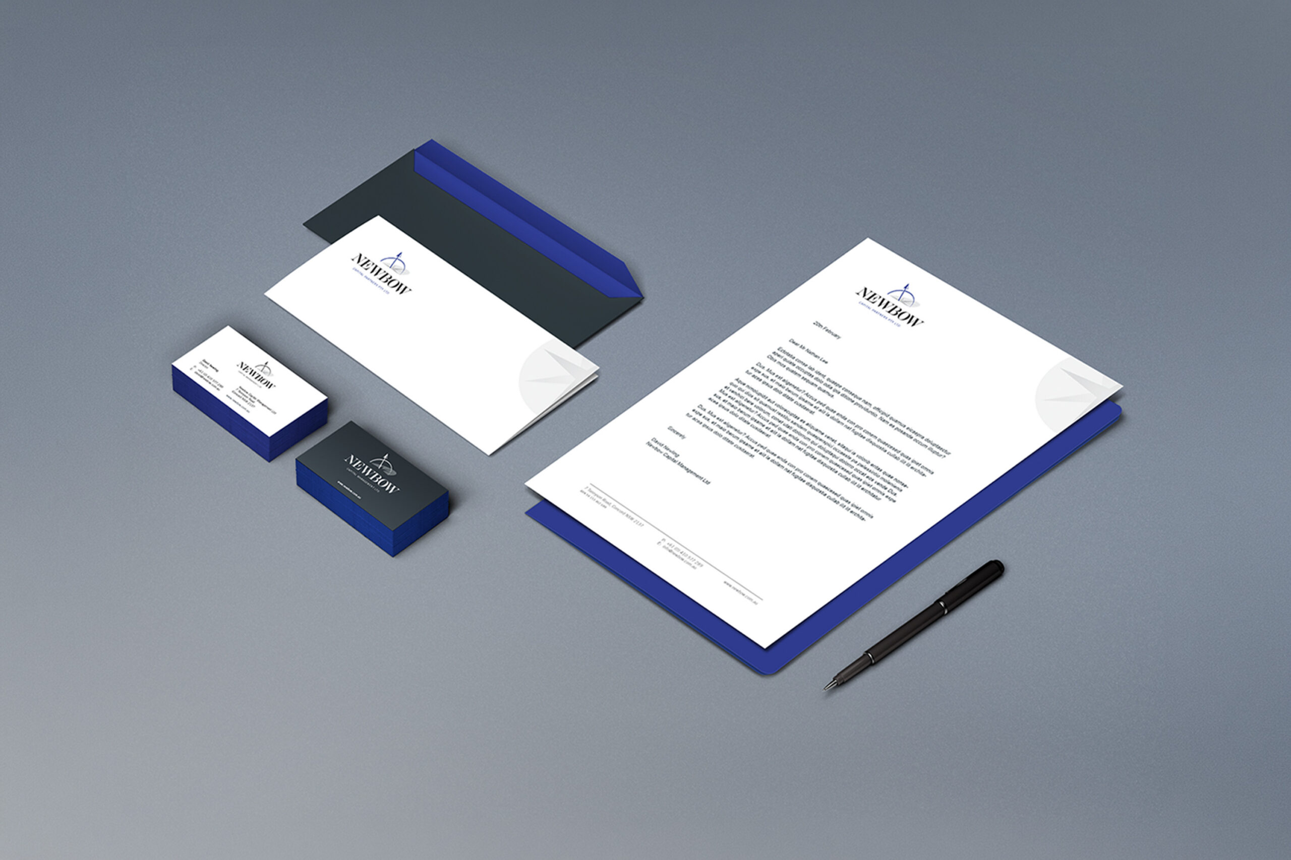
Newbow Capital Management wanted an identity that reflected its professionalism and careful approach to managing assets. The Australian firm needed to stand out in a competitive financial services market without losing that sense of discipline.
Mind Methods developed the corporate identity and a coordinated range of business and marketing materials. Brand guidance and logo variations gave the team a practical basis for using the identity consistently.


Needs & Brief
Create a strong, distinctive brand identity and apply it to the materials the firm used in business. The design needed to communicate the character of the organisation while remaining credible within financial services.
Challenges & Context
The identity had to feel individual without relying on decorative complexity. It also needed to work in different sizes, on different backgrounds and across the practical documents used by the business.
Consistency was therefore part of the brief from the beginning, not an issue to solve after the logo was complete.
Strategic & Creative Approach
We developed the corporate identity and logo around the client’s brief. The mark included an upward-facing bow, supported by variations for different uses and backgrounds.
The identity was applied across business and marketing collateral, with graphic design and print management supporting the finished materials.
Brand guidelines documented the approach so future applications could draw on the same foundation. The result was a coherent presentation across the firm’s materials rather than a standalone logo with no guidance for its use.
A professional identity needs to work in the ordinary materials people see every day. We developed the logo and its applications together so Newbow had a consistent presentation, not just a new mark.
Nathan Lee
Mind Methods